GetONE: Giving Great Taste a Look of Its Own
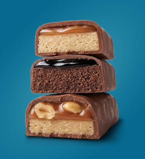
How do you make a protein bar look as good as it tastes?
For GetONE, we created a fresh, distinctive visual identity built around what matters most: seriously good taste, without the fuss.
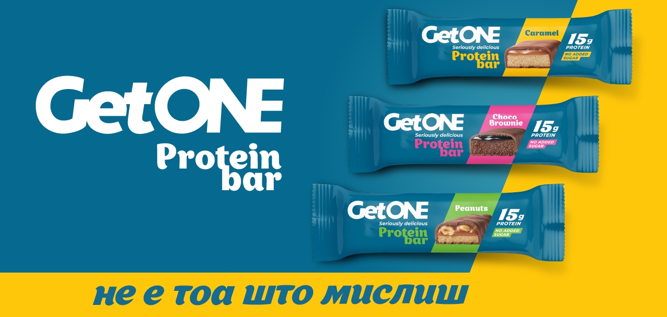
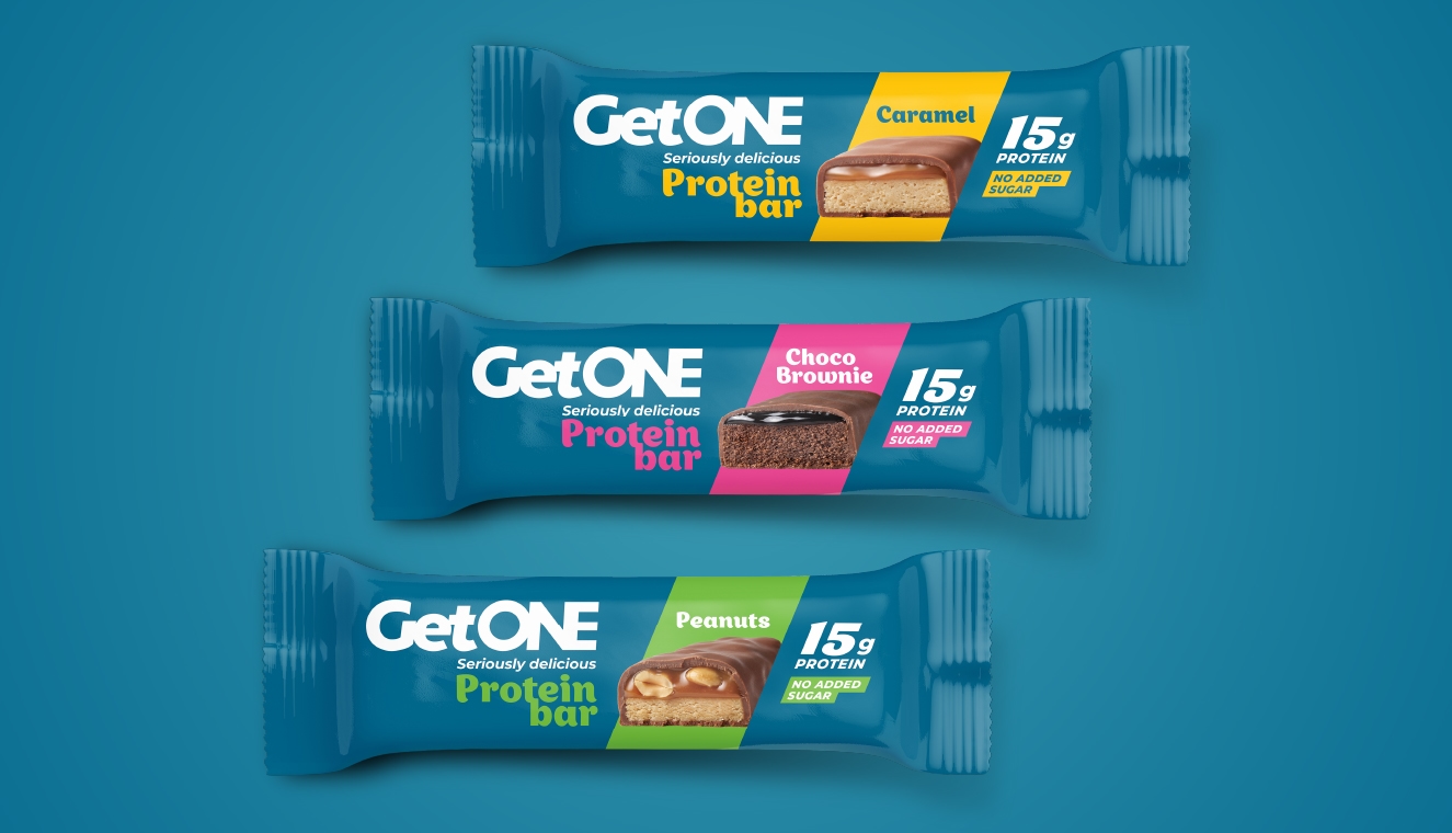
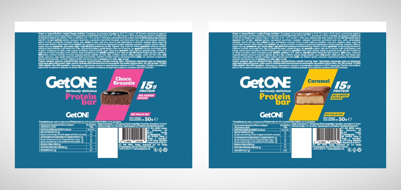
Packaging took centre stage. Choco Brownie, Peanut and Caramel each got a personality of their own – visually distinct, yet unmistakably part of the same family.
Bold colour, confident typography and a strong graphic language were designed to make GetONE easy to spot on the shelf – and even easier to remember.
The result? A brand with confidence and character. Contemporary, direct and delicious before you even take the first bite.
GetONE. It’s Not What You Think.
has context menu